
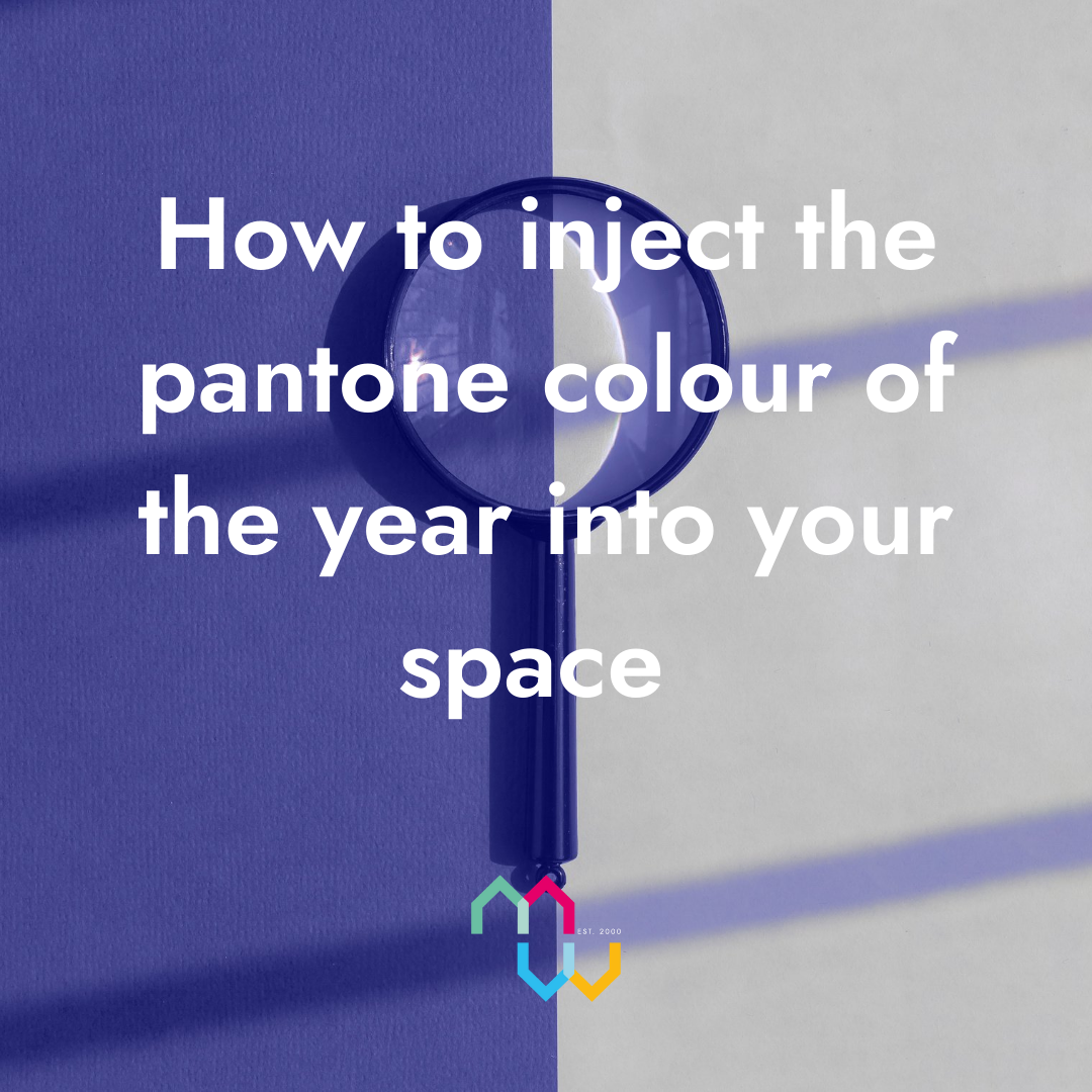
This year, Pantone have announced the colour of the year as ‘Very Peri’ which they say, ‘blends the faithfulness and constancy of blue with the energy and excitement of red to introduce an empowering mix of newness.’
The Pantone colour of the year
This year, Pantone have announced the colour of the year as ‘Very Peri’ which they say, ‘blends the faithfulness and constancy of blue with the energy and excitement of red to introduce an empowering mix of newness.’
Here are 4 ways to keep your homes colour scheme bang on trend.
- To make your lounge or bedroom cosier, ditch the wallpapered feature wall and use a very peri toned hue instead, think Monica and Rachels flat. If the kitchen cupboards need a revamp, Frenchic has a range of shades!
- Not only can a lick of paint to the walls cosy up your space, but ‘very peri’ is a great colour for sofas and upholstered furniture due to its warm and hue. For a crisp comforting living room, you can team this with soft off whites, to create a “timeless effect with a modern twist” (Graham & Brown).
- If you’re not quite sold on periwinkle walls and furniture, your neutral hues can be enhanced beautifully with brighter coloured accents, such as these scatter cushions from Wayfair.
- Rugs are also a fantastic way to incorporate this gorgeous colour combo into your space on a lower budget. I really like this one from Wayfair.
If you inject any very peri into your home this year, tag us on socials @movingworksestateagents
 By
By 

Share this with
Email
Facebook
Messenger
Twitter
Pinterest
LinkedIn
Copy this link